Techromancer - Motion Design & Graphic Design
Techromancer is a small indie game team dedicated to creating fun - human made - games for players. In order to better connect them with their target audience and help them self promote, I have created a variety of logos, design assets, and graphics to send them to the top of the leaderboards!
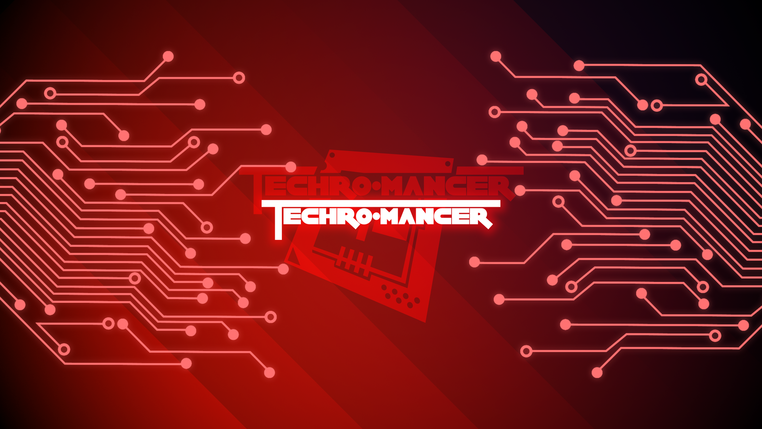
Techromancer - Logo Animation
Animated logo for use in game start up screens, social media, and other videos.
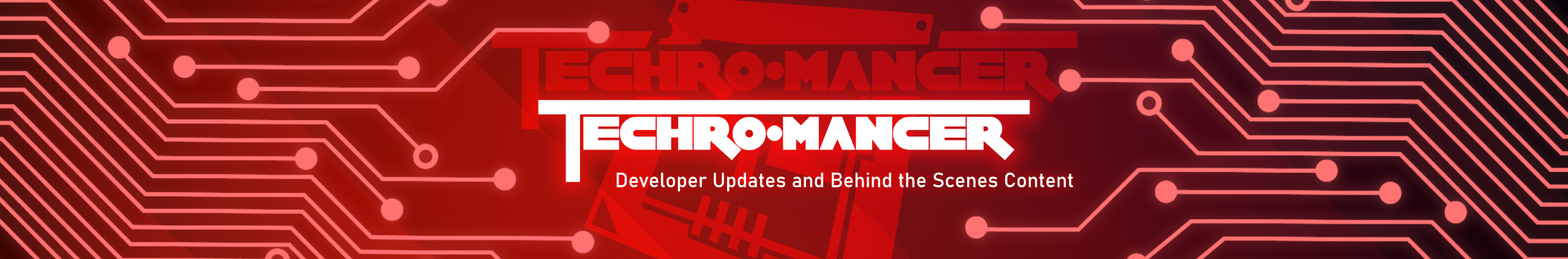
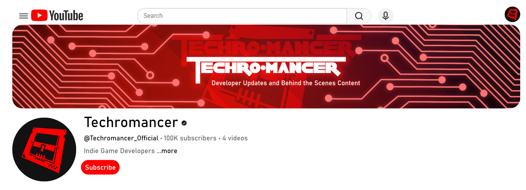
Techromancer - Social Media Assets
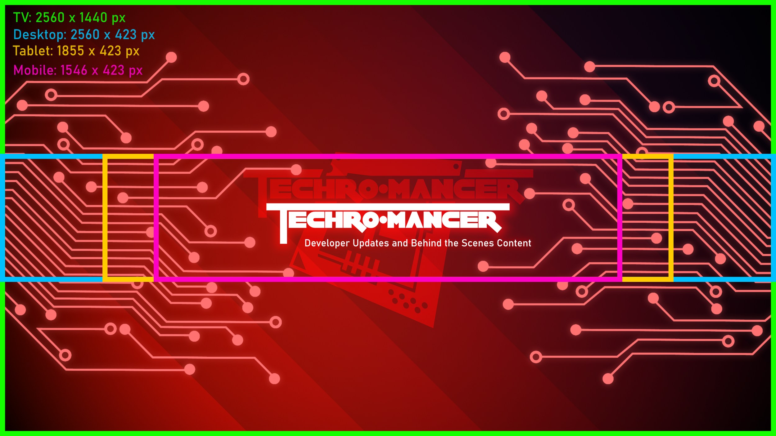
Youtube Banner
YouTube Thumbnail Template
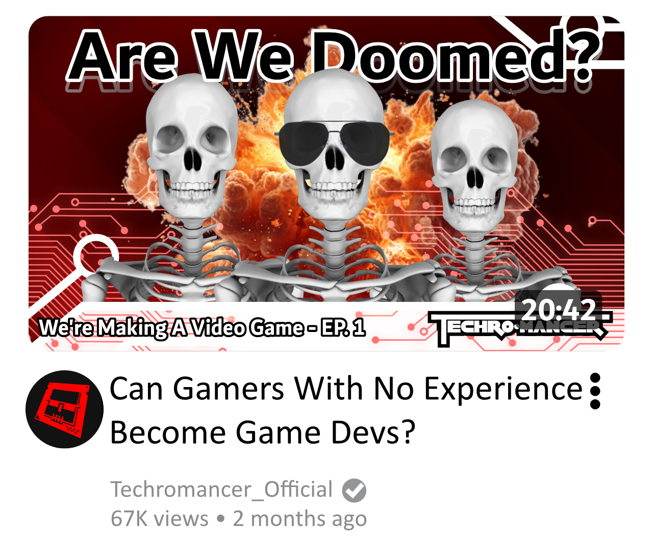
Designed to entice potential viewers and to be used as a reusable template to help productivity across Techromancer’s small team.
Seasonal Profile Pictures
Special Versions - used for community engagement around holidays and themed community events
Techromancer Logo : Design Process
1: Design Brief and Reference
Reference Board
The team at Techromancer loved one of the variations of the logo so I cleaned it up and created clean vector art for them to use in whatever digital/print avenue they might need. In addition I tackled one last note….
“Can you make it red?” ….I could.
Techromancer came to me as a newly established team looking for a logo and design work both to invigorate their future audience and jump start their own excitement for their first big project. They walked me through the style, tone, and overall feel of what they were creating and tasked me with creating a logo combining gaming, tech, and dark fantasy.
After our initial meeting I started my design process by creating a collection of reference that included targets that aligned with some of the media sources Techromancer was using internally for inspiration as well as other elements that align with their brand.
2: Initial Concepts
Once I had my references, I created a collection of font tests, sketches, and mock logos that I then presented to Techromancer. Based on this early design work we were able to have productive conversations about what they liked and what they didn’t. After this initial exploration were were able to come together and decide on a direction they were really excited about. The team really liked the CPU mixed with a skull as it captured the tech, dark fantasy, and gaming aesthetic they were looking for.
3: Refined Direction
From here I continued to develop the logo based on Techromancer’s feedback on the initial concepts. At this stage I created a range of rough variations in order to properly explore how the icon and typography would be integrated.
4: Clean It Up and Make It Red